Control interface
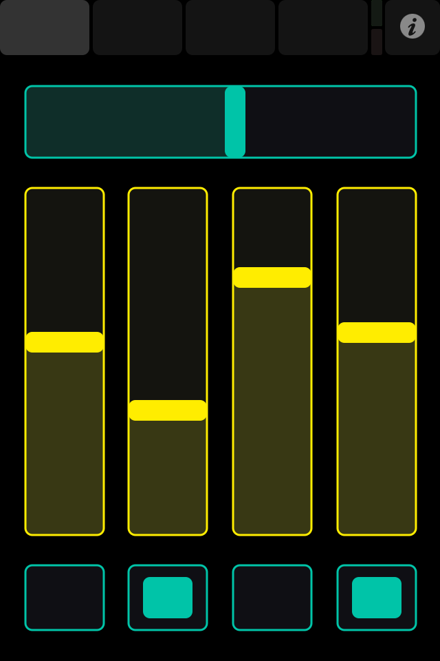
This is an example of what the TouchOSC control surface view looks like.
All the control elements you see on this page can be arranged and configured freely using the TouchOSC Editor application, which we'll discuss later on. However, at the very top there are some controls that do stay the same no matter which layout you have loaded, so let's focus on these:
Most space is being used to display one or more larger, rounded rectangular buttons, one of which is always highlighted. This is TouchOSC's Tab-bar, and it allows you to switch between the pages of a layout. The number of these buttons depends on how many pages a layout contains, but there is always at least one.
To the right of the Tab-bar there's two small indicators. These indicate that OSC or MIDI messages are being sent (the upper indicator, green) or received (the lower indicator, red).
To the right of these two indicators there's one button labelled with a circle, which will take you back to TouchOSC's main configuration screen.
